Folks, I know that designing a poster isn't what you're used to as an assessment. Later on in the course, you might be able to figure out why I did this (part of the authentic learning module). OK, what I thought I'd do is to give you an opportunity to see a poster submission in action. This is a paper that I submitted along with a few others, for a conference held in Japan, I think in 2004. This is a poster that was designed for a very different audience than the one that you're designing for (academic health professionals).
There were actually two posters but I've only given one of the posters which can be downloaded from here.
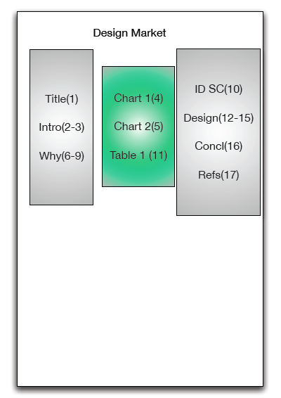
OK, now to know how to lay this poster out, there is another file which you download from here. On the very last page you will see the a diagram which gives instructions how to lay out the poster (some of the diagrams were for the other poster display not given here).
You can see that the design is three columns, with the middle (green) column consisting of all the diagrams that we constructed for the poster. The columns either side of it were the text. Each heading in the two outside columns (grey) show the page number(s) associated with it. There were therefore 7 pages in the left hand column; 3 in the middle; and 6 pages in the right hand column.
This was enough for the conveners to layout the poster with A4 print outs. Notice how the text for each page is LARGE, so that folks standing and reading it could read it without having to squint at it.
If I made this diagram again, I would show small boxes for each page, ie it would show all the wee boxes for each A4 page just to make it super simple to see/follow'. Hope this helps